Behind every smooth, intuitive interface lies a thoughtful process - one that translates ideas into tangible, functional designs. It's a systematic process that transforms user needs into intuitive, functional, and delightful digital experiences. The best UI designers follow proven methodologies that balance creativity with research, strategy with execution, and innovation with usability.
In this article, we’ll walk through each stage of the UI design process - from defining the problem to testing and refinement - providing frameworks and techniques that professional designers use to create interfaces that truly serve users and achieve business goals.
Understanding the UI Design Process
The UI design process is both linear and iterative - while certain phases naturally follow others, designers constantly loop back to refine and improve their work based on new insights. This process is grounded in design thinking methodology, a human-centered approach that emphasizes empathy, experimentation, and iteration.
The eight phases of UI design closely align with design thinking's core stages:
- Discovery and Research (Empathize)
- Strategy and Planning (Define)
- Ideation and Concept Development (Ideate)
- Visual Design and Prototyping (Prototype), and
- Testing and Validation (Test)
This alignment ensures that design decisions are grounded in user research, validated through testing, and aligned with business objectives.
Modern UI design operates within broader product development cycles, requiring close collaboration with researchers, product managers, developers, and stakeholders. Success depends not just on design skills, but on the ability to navigate complex requirements, technical constraints, and user feedback throughout the development process.
The most effective UI designers master not just visual design skills but the entire process from research through post-launch optimization. They collaborate effectively with cross-functional teams, advocate for user needs while addressing business requirements, and continuously improve their work based on evidence rather than assumptions.
UI Design Phase 1: Discovery and Research
Good UI starts with a deep understanding of the people who will use it and what problem we are trying to solve for them. This phase involves gathering information about users, business requirements, technical constraints, and competitive landscape. Let's talk about each of them individually:
Understanding the users:
Understanding users requires systematic research using multiple methodologies.
- User interviews provide qualitative insights into behaviors, motivations, and pain points.
- Surveys can gather quantitative data from larger user groups.
- Analytics review reveals current user behavior patterns and drop-off points.
- Contextual inquiry observes users in their natural environment performing real tasks.
The key is selecting research methods that match project constraints and information needs. Early-stage products might rely more heavily on user interviews and competitive research, while established products can leverage existing analytics and user feedback. The research phase should produce clear insights about user goals, current frustrations, and success metrics.
Creating User Personas and Journey Maps
Research findings need to be synthesized into actionable design tools. User personas represent key user segments with their goals, behaviors, pain points, and contexts. Effective personas are specific enough to guide design decisions but broad enough to represent meaningful user groups.
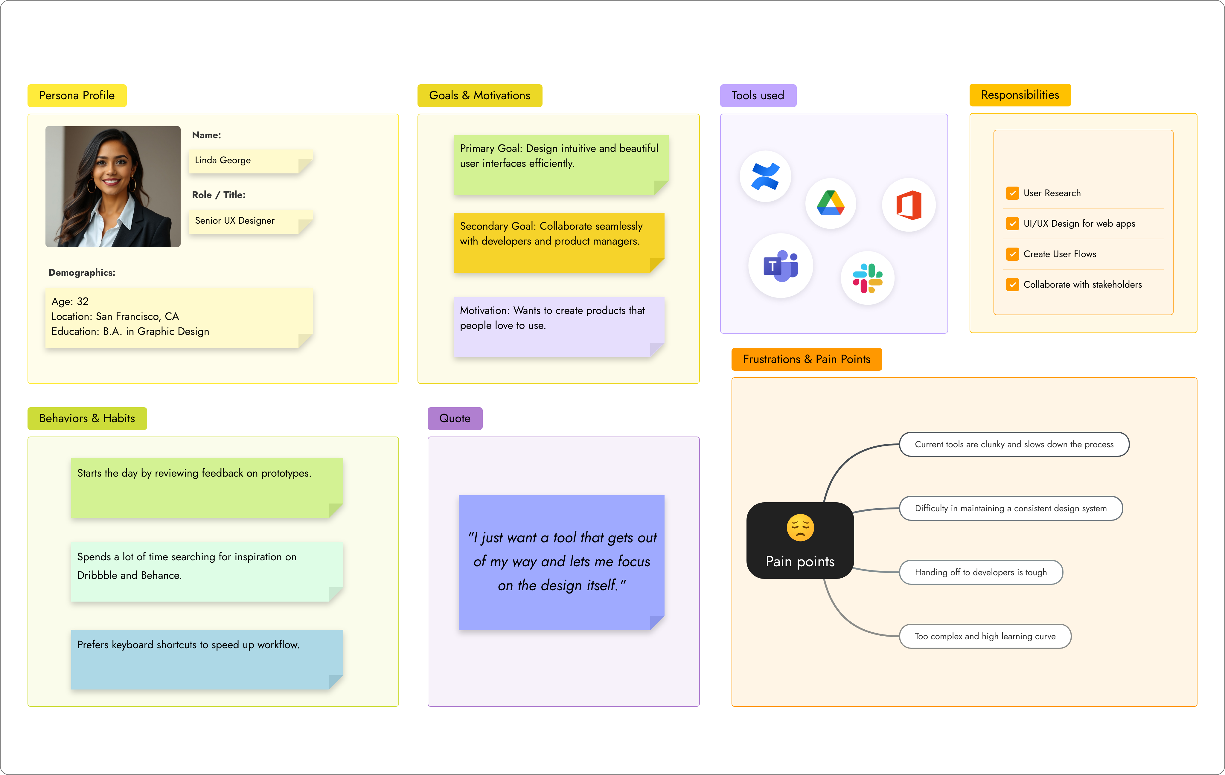
An example User Persona
User journey maps visualize the complete user experience across touchpoints, revealing opportunities for improvement and moments of friction. These maps help designers understand the broader context surrounding their interface design and identify where UI improvements can have the greatest impact.
Competitive Analysis and Benchmarking
Understanding the competitive landscape reveals industry standards, user expectations, and opportunities for differentiation. Competitive analysis should examine not just direct competitors, but also products that solve similar problems or target similar users in different contexts.
The goal isn't to copy competitors, but to understand the baseline user expectations and identify where superior design can create competitive advantage.
UI Design Phase 2: Strategy and Planning
Defining Design Requirements
Research insights must be translated into specific design requirements that guide the creation process. These requirements include functional specifications that define what the interface must do, user experience goals that establish success criteria, technical constraints that limit implementation options, and brand guidelines that ensure visual consistency.
Clear requirements prevent scope creep and provide criteria for evaluating design decisions. They should be specific enough to guide design choices but flexible enough to allow creative problem-solving. Requirements often evolve as the project progresses, but establishing initial parameters creates a solid foundation.
Information Architecture
Before designing individual screens, designers must organize information and functionality into logical structures. Information architecture defines how content is grouped, labeled, and connected. This invisible foundation determines whether users can find what they need and understand how different parts of the interface relate.
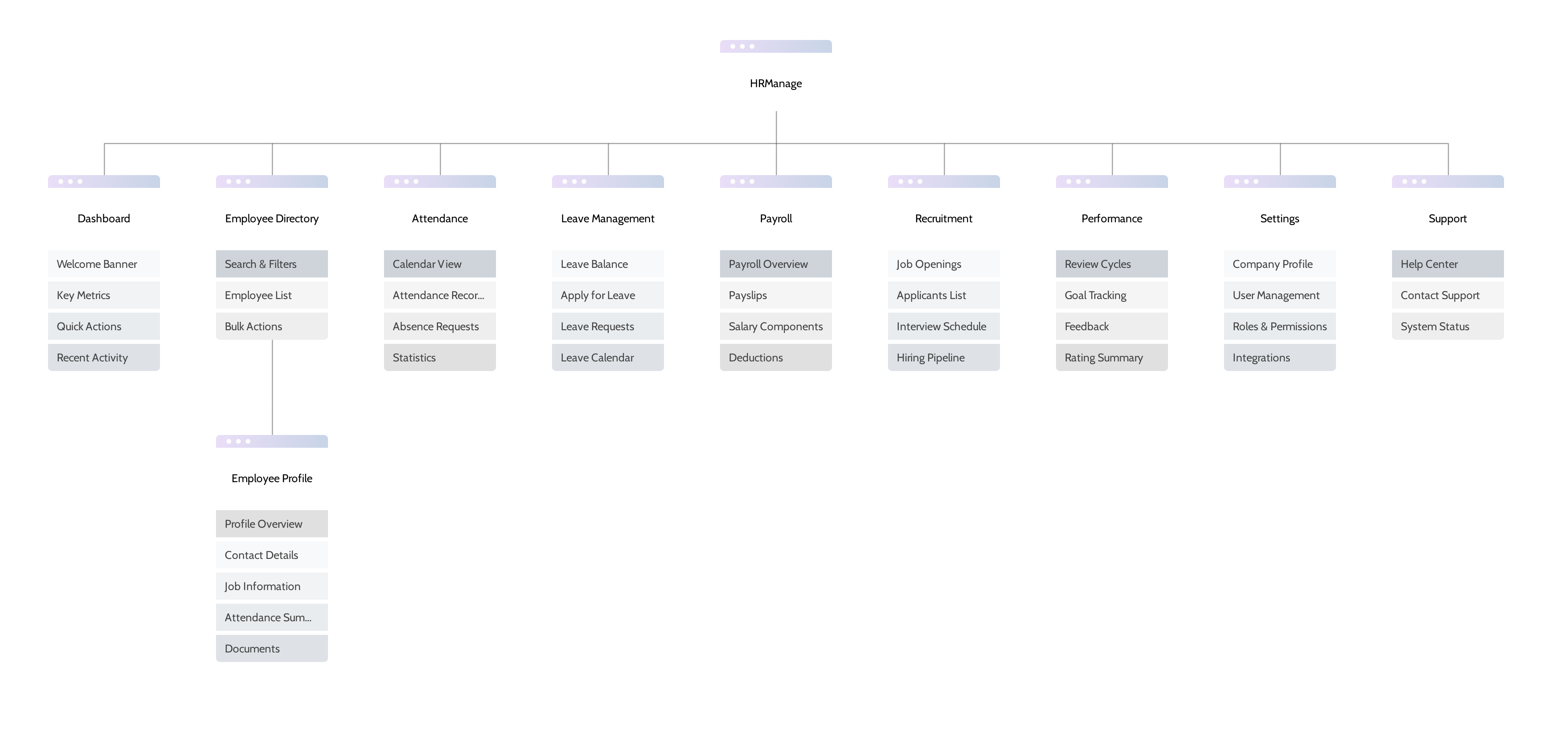
Planning Information architecture for a HR management app
Effective information architecture starts with understanding user mental models - how users expect information to be organized. Card sorting exercises, tree testing, and prototype validation help ensure the structure matches user expectations. The architecture should support both novice users exploring the interface and expert users seeking efficiency.
User Flow Mapping
User flows diagram the paths users take to accomplish specific goals. These flows reveal the sequence of screens, decisions points, and interactions required for key tasks. Mapping flows early identifies potential friction points and ensures the interface supports natural user behavior.
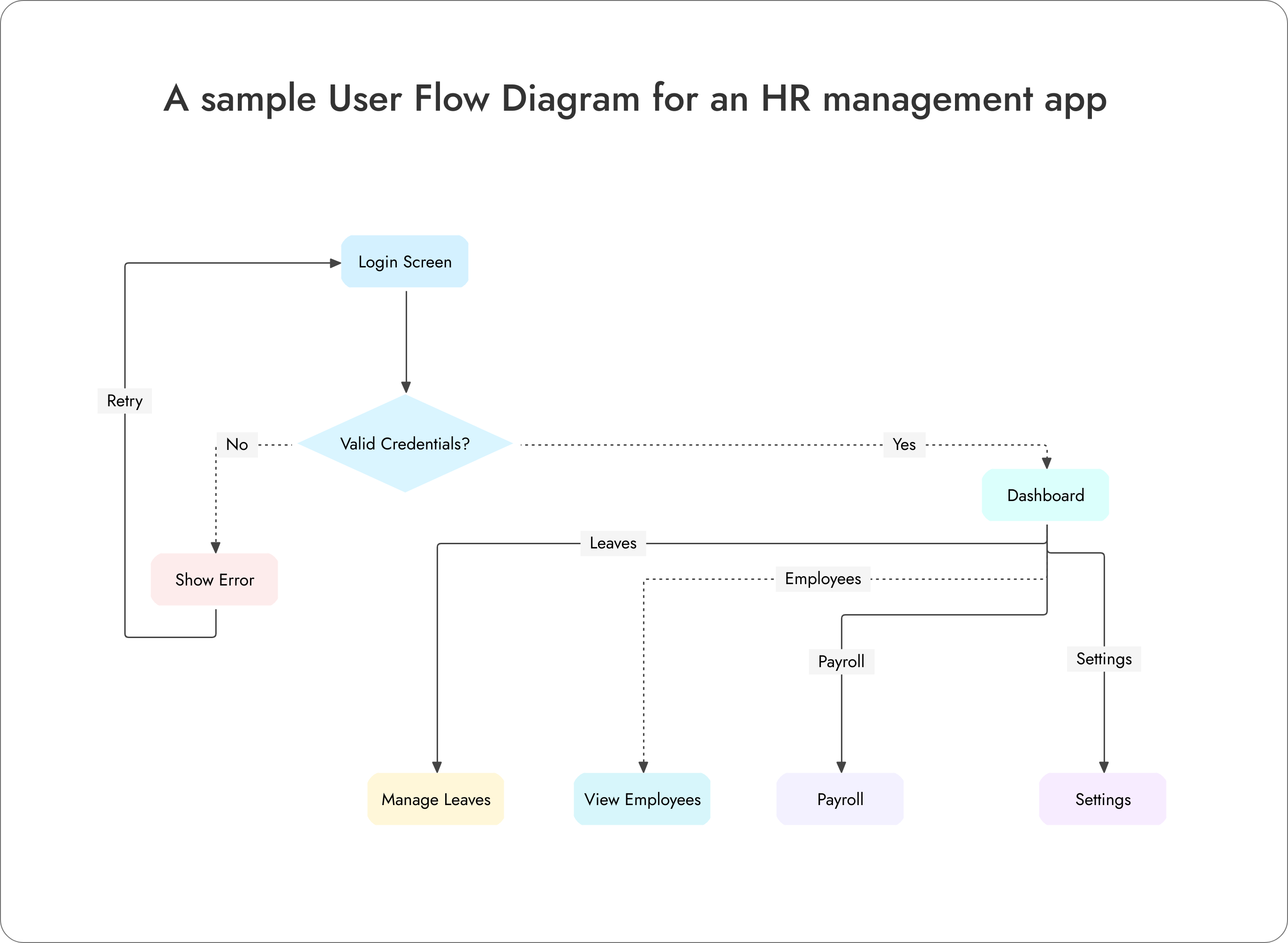
A simple example of an user flow diagram
Flows should account for different user types, error states, and edge cases. They help designers understand the relationship between different screens and ensure consistent interaction patterns throughout the interface. Well-designed flows feel effortless to users because they match natural task progression.
Content Strategy and Copywriting
Interface design isn't just visual - the words users see are important for usability and user experience. Content strategy determines the tone, voice, and messaging approach. Microcopy includes button labels, error messages, help text, and other interface text that guides user behavior.
Effective interface copy is clear, concise, and action-oriented. It helps users understand what they can do and provides guidance when they're uncertain. Content strategy should be developed alongside visual design to ensure cohesive user experience across all touch points.
UI Design Phase 3: Ideation and Concept Development
Sketching and Low-Fidelity Wireframes
The ideation phase begins with rapid exploration of design concepts through sketching and low-fidelity wireframes. This approach allows designers to explore many different solutions quickly without getting caught up in visual details. Sketching is particularly valuable for exploring layout options, interaction patterns, and information hierarchy.
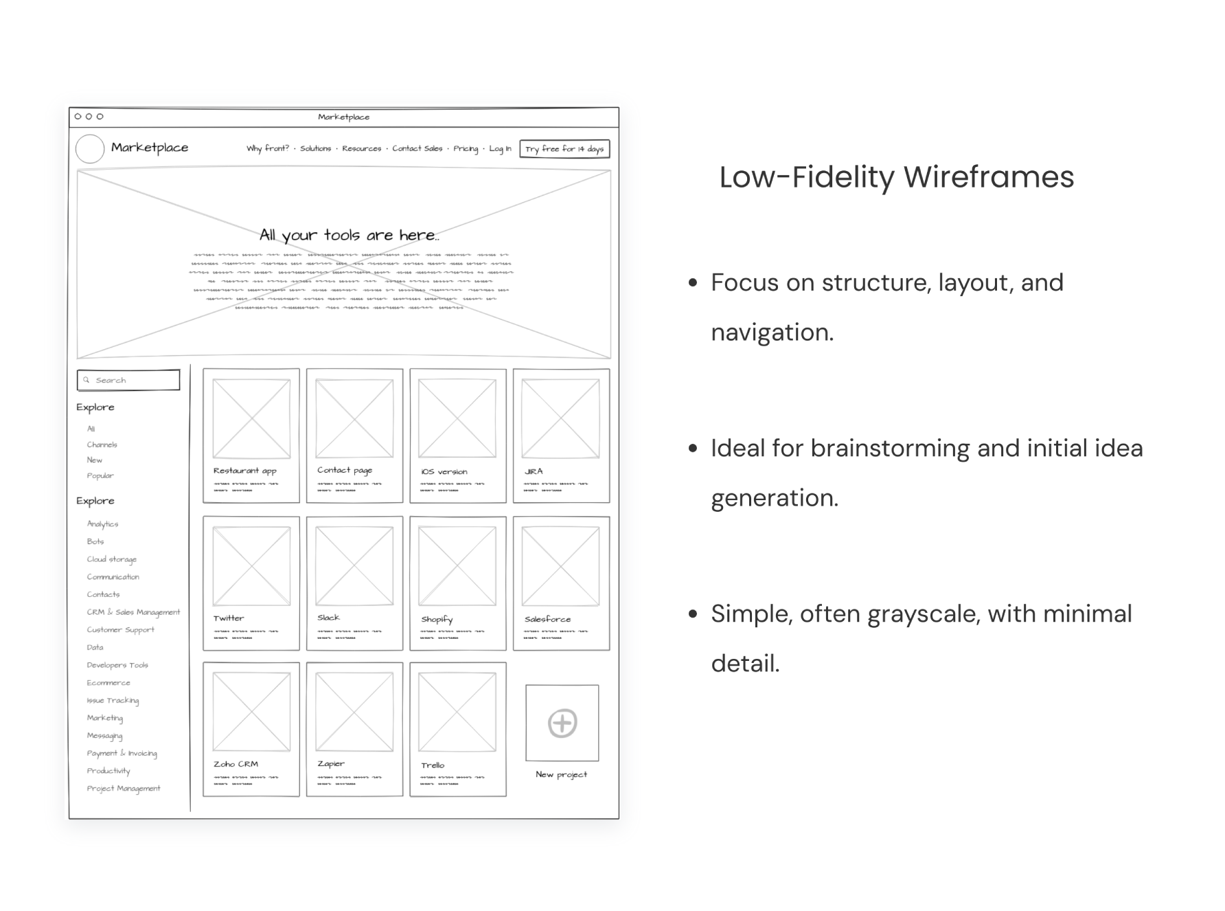
Low-fidelity wireframes translate promising sketches into more structured layouts. These wireframes focus on content organization, functional elements, and user flow without committing to specific visual treatments. They're excellent tools for gathering feedback from stakeholders and users about fundamental design directions.
Design System Planning
Modern UI design requires systematic thinking about reusable components and patterns. During ideation, designers should consider how individual screens fit into broader design systems. This includes identifying common elements like buttons, forms, navigation patterns, and content layouts that will appear throughout the interface.
Planning for systematization early prevents inconsistencies and reduces future design debt. It also enables more efficient design and development processes as the project scales. Design system thinking helps ensure coherent user experience across different parts of the interface.
Accessibility Considerations
Accessible design should be considered from the earliest stages of the process, not retrofitted later. During ideation, designers should consider how different users with varying abilities will interact with the interface. This includes visual accessibility concerns like color contrast and text sizing, motor accessibility for touch targets and interaction methods, and cognitive accessibility for information processing and navigation.
Designing for accessibility often leads to better experiences for all users. Clear visual hierarchy, consistent interaction patterns, and thoughtful content organization benefit everyone. Early accessibility planning prevents expensive redesigns and ensures compliance with accessibility standards.
UI Design Phase 4: Visual Design and Prototyping
High-Fidelity Design Creation
With wireframes and concepts validated, designers create high-fidelity visual designs that specify exact layouts, typography, colors, spacing, and interactive elements. This phase brings together brand requirements, usability principles, and aesthetic considerations into polished interface designs.
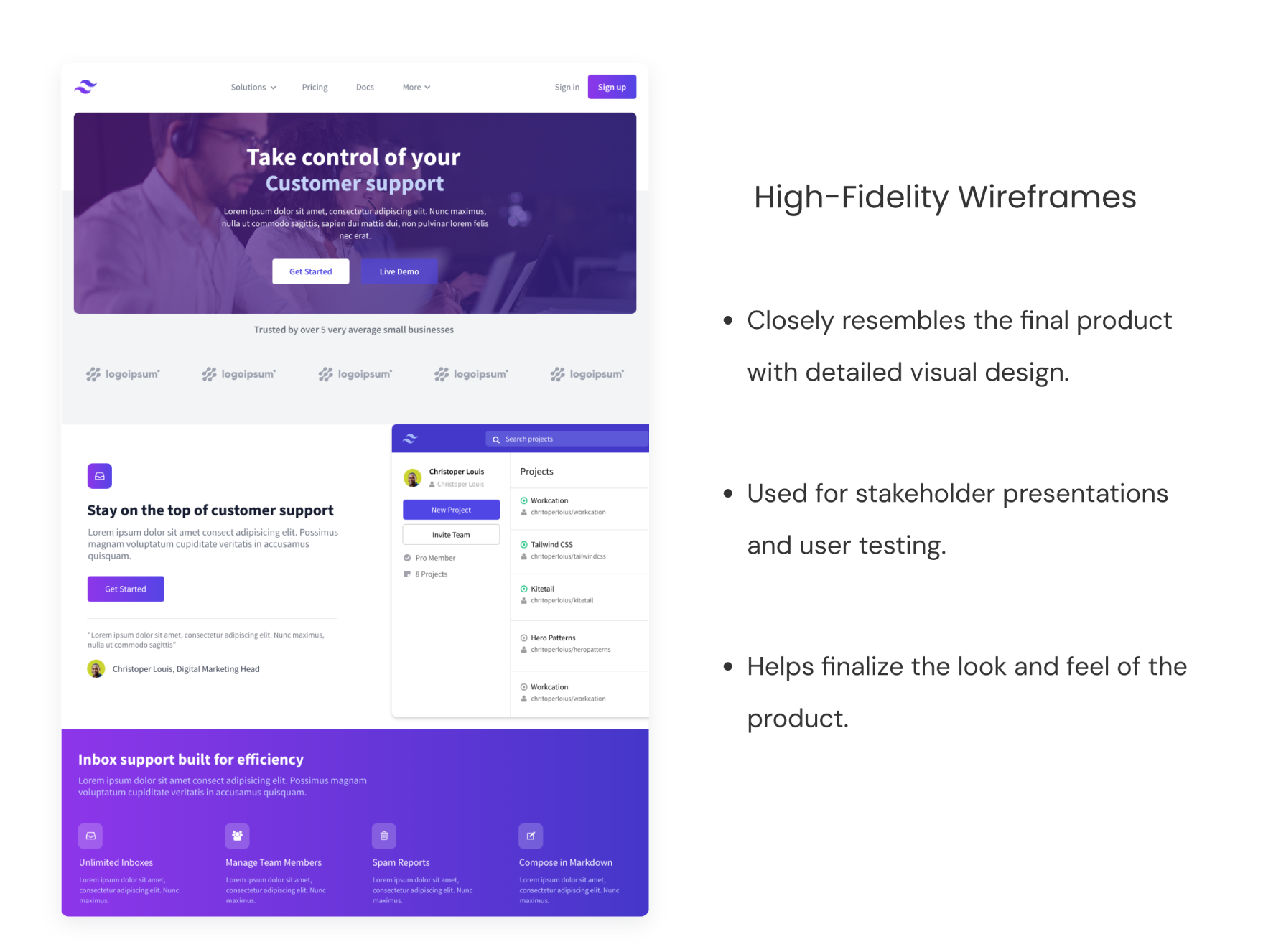
High-fidelity designs should specify all visual details needed for development implementation. This includes precise measurements, color codes, typography specifications, and interaction states.
Typography and Visual Hierarchy
Typography choices significantly impact both usability and brand perception. Designers must select fonts that are readable across devices, establish clear hierarchy through size and weight variations, and ensure adequate contrast for accessibility. Typography should support scanning and comprehension while reflecting brand personality.
Visual hierarchy guides users through content and functionality in order of importance. This hierarchy uses size, color, contrast, spacing, and positioning to establish clear relationships between elements. Effective hierarchy helps users quickly understand what they can do and what information is most important.
Color Palette and Branding
Color serves both functional and emotional purposes in interface design. Functional color use includes consistent meanings for actions (like red for deletion or green for success), adequate contrast for accessibility, and clear distinction between interactive and static elements. Emotional color use supports brand identity and creates appropriate mood for the user experience.
Color palettes should be systematic and scalable. This includes primary colors for key actions, secondary colors for supporting elements, neutral colors for backgrounds and text, and semantic colors for states like errors, warnings, and success. The palette should work across different devices and viewing conditions.
Interactive Prototyping
Static designs can't fully communicate interactive experiences. Prototyping enable designers to create clickable, animated versions of their designs that demonstrate user flows, micro-interactions, and responsive behavior. Prototypes are essential for validating interaction design and communicating with development teams.
Effective prototypes match the fidelity needed for their purpose. Early concept prototypes might be simple clickthrough demonstrations, while final prototypes might include detailed animations and state changes. The key is creating prototypes that accurately represent the intended user experience without over-investing in temporary artifacts.
UI Design Phase 5: Testing and Validation
Usability Testing Methods
Design validation requires observing real users attempting to accomplish tasks with the interface. Moderated usability testing involves watching users navigate prototypes while thinking aloud, revealing where they struggle or feel confused. Unmoderated testing allows observation of natural user behavior without researcher influence.
A/B testing compares different design approaches with real users to identify which performs better for specific metrics. Eye tracking studies reveal where users look and how they scan interface layouts. Each testing method provides different insights, and the best approach often combines multiple methodologies.
Iterative Design Refinement
Testing inevitably reveals opportunities for improvement. The iterative refinement process involves analyzing testing results, identifying specific problems, generating improved solutions, and testing again. This cycle continues until the interface meets usability and performance criteria.
Effective iteration requires balancing user feedback with business requirements and technical constraints. Not every user suggestion should be implemented, but patterns of confusion or frustration indicate areas needing attention. The goal is continuous improvement toward better user experience and business outcomes.
Feedback Integration
UI design projects involve multiple stakeholders with different perspectives and priorities. Gathering and integrating feedback requires structured processes that ensure all voices are heard while maintaining design coherence. Regular design reviews, collaborative annotation tools, and clear feedback frameworks help manage this complexity.
UI Design Phase 6: Design System Development
Component Libraries
Systematic design requires creating reusable components that maintain consistency across the interface. Component libraries document the behavior, appearance, and usage guidelines for elements like buttons, forms, modals, and navigation. These libraries serve both design and development teams.
Effective component design considers all possible states and variations. A button component might include default, hover, active, disabled, and loading states. Documentation should specify when and how to use each component, ensuring consistent implementation across different screens and contexts.
Style Guides and Documentation
Comprehensive style guides document the visual language underlying the interface design. This includes typography scales, color palettes, spacing systems, iconography, and interaction patterns. Style guides ensure consistency and enable other team members to make design decisions aligned with established standards.
Documentation should be accessible to both designers and developers. This often means providing specifications in multiple formats - design files for designers, code snippets for developers, and written guidelines for everyone. This is where MockFlow Design spaces can be a life saver - one source of truth for all - from wireframes, style guides, documentation and code snippets - all in one place.
UI Design Phase 7: Development Collaboration
Design Handoff Process
Translating designs into functional interfaces requires close collaboration between designers and developers. Effective handoff processes include detailed specifications, design assets, and clear communication channels.
The handoff should include all information developers need for accurate implementation: measurements, colors, fonts, interactions, and edge cases. Regular check-ins during development help catch implementation issues early and ensure the final product matches design intentions.
Quality Assurance and Testing
Design implementation rarely matches designs exactly on the first attempt. Quality assurance processes involve reviewing implemented interfaces against design specifications and user experience requirements. This includes visual accuracy, interaction behavior, responsive behavior, and accessibility compliance.
Cross-browser and cross-device testing ensures consistent experience across different user environments. Identifying and fixing issues before launch prevents poor user experiences and expensive post-launch fixes.
Performance Optimization
Interface design decisions directly impact performance. Large images, complex animations, and numerous web fonts can slow loading times and reduce user satisfaction. Performance optimization involves balancing visual quality with loading speed and responsiveness.
Design optimization strategies include image compression and format selection, animation performance considerations, font loading strategies, and critical path optimization. Designers should understand how their decisions affect performance and work with developers to optimize without compromising user experience.
Continuous Improvement Process
UI design doesn't end at launch - it requires ongoing optimization based on user feedback and behavioral data. Continuous improvement processes involve regular analysis of user data, identification of optimization opportunities, design and testing of improvements, and systematic deployment of updates.
The key is establishing regular cycles of measurement, analysis, and improvement that keep the interface aligned with evolving user needs and business goals.
Why using the Design Process Matters
It’s tempting to skip ahead to the polished screens. But without a process, UI design becomes guesswork. You might end up designing something that looks beautiful - and that completely misses the mark. Success comes from understanding users deeply, applying proven design principles consistently, and iterating based on real feedback and data.
The designers who master this process will create interfaces that truly serve users and achieve lasting business success. That's the ultimate goal of great UI design - creating digital experiences so intuitive and helpful that users can focus on their goals rather than figuring out the interface.
And, that’s where MockFlow comes in.
MockFlow helps you plan, wireframe, map user flows, and collaborate with your team - all in one place. Whether you're sketching early ideas or polishing your final layout, it supports every stage of the UI design process. Start designing with MockFlow.