Did you know that the best UI isn’t the one that dazzles - but the one you don’t even notice?
The true goal of UI design isn’t to impress - it’s to disappear. To feel so natural, so intuitive, that users move through it effortlessly - never once stopping to think about the design itself.
Users never think about the buttons they're clicking, the menus they're navigating, or the forms they're filling out - they simply accomplish what they came to do. But when UI design fails, every interaction becomes a barrier. Users struggle with confusing layouts, hunt for hidden features, and eventually give up in frustration.
This is why mastering UI design principles isn't just about making things look pretty - it's about creating digital experiences that feel effortless and natural. This comprehensive guide explores the fundamental principles that separate interfaces people love from those they abandon.
What Are UI Design Principles?
UI design principles are foundational guidelines that help shape how users interact with digital interfaces. These principles inform decisions around layout, visual hierarchy, interaction patterns, consistency, and accessibility - ultimately influencing how usable and intuitive a product feels.
They are not strict rules, but rather best practices drawn from years of design research, user behavior analysis, and real-world experience. Designers rely on these principles to ensure that their interfaces aren't just visually appealing, but also functional, predictable, and user-friendly.
Whether you're designing a mobile app, a SaaS dashboard, or a simple website, UI principles act as a compass - helping you make better decisions at every stage of the process.
Why UI Principles Matter
You can have the most innovative features, the fastest backend, or the best branding — but if users can’t figure out how to use your interface, none of it matters.
Good UI design isn’t accidental. It’s intentional.
Here’s why UI principles are essential:
- They reduce friction. A well-designed interface minimizes the number of decisions a user has to make, guiding them clearly from action to outcome.
- They build trust. Consistency and predictability make users feel in control. When a product behaves as expected, users are more likely to engage and return.
- They improve accessibility. Following established principles helps ensure your design works for a wide range of users — including those with disabilities.
- They scale design decisions. As products grow, principles help teams stay aligned, ensuring that every part of the interface feels like it belongs to the same system.
Most importantly, UI principles help you design with the user in mind — not just what looks good, but what feels right to interact with.
Who Created These UI Design Principles?
UI design principles don’t originate from a single person or institution. Instead, they’ve evolved over decades — shaped by the work of usability pioneers, cognitive psychologists, interaction designers, and product teams building real-world digital systems.
Some of the most influential contributors include:
- Don Norman, cognitive scientist and author of The Design of Everyday Things, who introduced key ideas about affordances, feedback, and user-centered design.
- Jakob Nielsen, usability expert and co-founder of Nielsen Norman Group, who formulated the well-known 10 Usability Heuristics for User Interface Design, widely adopted as core UI/UX guidelines.
- Ben Shneiderman, a pioneer in human-computer interaction, formulated the Eight Golden Rules of Interface Design, advocating for consistency, meaningful feedback, and the importance of reducing short-term memory load — all of which underpin modern UI design systems.
- Alan Cooper, known as the “Father of Visual Basic,” introduced the concept of goal-directed design and was instrumental in establishing personas as a method to design interfaces around real user needs. His book About Face remains a cornerstone of interaction design.
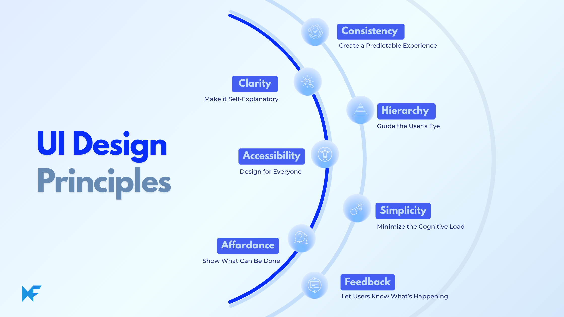
7 Design Principles for better UI design
Design Principle #1: Clarity
Make Interfaces Self-Explanatory
Clarity stands as the most fundamental principle in UI design.
Users shouldn’t have to guess. Every button, icon, and piece of text should communicate its purpose immediately. Clarity reduces friction and prevents mistakes.
This principle shows up in clean layouts, easy-to-follow navigation, and removing anything that adds clutter or distracts the user.
Design Principle #2: Consistency
Create a Predictable Experience
Consistency builds trust. When interface elements behave similarly across your product, users learn once and apply everywhere — reducing cognitive load.
This principle operates on multiple levels: visual consistency through uniform color schemes, typography, and spacing; functional consistency through standardized interaction patterns; and conceptual consistency through coherent information architecture.
Platform conventions play a crucial role in consistency. Users develop expectations based on their experience with operating systems and common applications. Adhering to established patterns while innovating thoughtfully creates familiar yet distinctive interfaces.
Design Principle #3: Hierarchy
Guide the User’s Eye
Not all elements are equal. Hierarchy lets you emphasize the most important parts of your interface through visual cues like size, contrast, and positioning.
This principle uses size, color, contrast, spacing, and positioning to establish clear relationships between elements. Effective hierarchy helps users scan content quickly and understand the relative importance of different interface components.
Information architecture supports hierarchy by organizing content and functionality into logical groups. Well-structured navigation systems, categorization schemes, and search functionality enable users to find what they need efficiently.
Design Principle #4: Accessibility
Design for Everyone
A good UI should be usable by all people - regardless of ability. Designing with accessibility in mind ensures that your product reaches the widest audience.
This includes considerations for visual, auditory, motor, and cognitive accessibility. Proper color contrast, keyboard navigation, screen reader compatibility, and alternative input methods make interfaces accessible for diverse audience.
Inclusive design goes beyond compliance to consider diverse user needs from the beginning of the design process. This approach often results in better experiences for all users, not just those with specific accessibility requirements.
Design Principle #5: Simplicity
Minimize the Cognitive Load
Simple interfaces are easier to understand and less overwhelming. Too much information or too many choices can paralyze users (the paradox of choice).
Simplicity doesn't mean minimal - it means purposeful. Every element should serve a specific function and contribute to the overall user experience. The famous design principle "form follows function" applies directly to UI design, where visual elements should clearly communicate their purpose and behavior.
Design Principle #6: Feedback
Let Users Know What’s Happening
Every user action should produce a visible reaction. Feedback helps users understand whether their input was received or an error occurred.
This includes loading states, error messages, confirmation dialogs, and progress indicators. Effective feedback helps users understand what's happening, what they've accomplished, and what they can do next. Lack of feedback leaves users unsure if the action worked, which can lead to repeated attempts or abandonment.
Micro-interactions - small, subtle animations and responses - provide immediate feedback for user actions. These details significantly impact perceived responsiveness and overall user satisfaction.
Design Principle #7: Affordance
Show What Can Be Done
Affordance refers to visual cues that indicate how an element can be interacted with. Without it, users may not know what actions are available.
In the context of UI, it's how the design of an element gives users a clue about what they can do with it - even before they interact with it.
The term was first introduced by psychologist James J. Gibson, and later expanded in the design world by Don Norman, who made it central to user-centered design.
In UI terms, affordance answers the question: “What can I do with this thing - and how do I know that?”
Start Building Better UIs Today
UI design principles aren’t just theory - they’re the foundation of every great user experience. When applied thoughtfully, they help ensure that users feel comfortable, confident, and empowered when interacting with your product.
Great UI design doesn’t just look good - it works beautifully.
Whether you’re sketching out a new feature, redesigning an onboarding flow, or building an entire product interface from scratch, these principles should inform every design decision.
If you’re looking for a way to visualize and apply these principles before writing a single line of code, MockFlow makes it easy. With wireframing, user flows, and design system planning all in one place, MockFlow helps you turn abstract principles into concrete, collaborative designs - fast.
Start your next UI project with MockFlow and design with clarity, consistency, and purpose.