Ever opened a new app and instinctively known where the menu, search bar, or checkout button would be - without reading a single instruction?
That’s the power of UI design patterns.
These reusable solutions solve common interface problems in familiar ways. Instead of reinventing the wheel each time, designers rely on tried-and-tested patterns that users already understand. Whether you're building a login form, a product filter, or a tabbed navigation bar, UI patterns help you design faster and smarter - without sacrificing usability.
In this guide, we’ll break down what UI design patterns are, why they matter, and when to use them - along with examples across real interface scenarios.
What are UI Design Patterns?
User Interface (UI) design patterns are reusable solutions to common design problems that occur repeatedly in user interface design.
A true UI design pattern consists of four key elements:
- Problem: A recurring design challenge that appears across different contexts
- Context: The specific circumstances where this problem occurs
- Solution: A proven approach to solving the problem
- Rationale: The reasoning behind why this solution works
For example, when users need to navigate through large amounts of content (problem) in a space-constrained interface (context), pagination provides numbered page controls (solution) because it allows users to understand their location and jump to specific sections efficiently (rationale). Other examples include tab bars, modal dialogs, progress indicators, toast messages, and expandable accordions.
Why Design Patterns are important?
Understanding and implementing UI design patterns plays a key role that impact both user experience and business success.
User Mental Models
Humans naturally develop mental models - internal representations of how things work based on past experiences. When you use a familiar pattern like a hamburger menu, users immediately understand its function without needing to learn something new. This cognitive efficiency reduces mental load and creates a smoother user experience.
Consider how users expect a shopping cart icon to behave. Regardless of whether they're on Amazon, a local bakery's website, or a fashion retailer, users have learned that clicking this icon will show their selected items. Breaking this expectation creates confusion and friction.
Development Efficiency
Patterns accelerate the design and development process by providing pre-tested solutions. Instead of reinventing the wheel for every project, teams can focus their creative energy on unique business problems while relying on proven patterns for standard interactions.
This efficiency extends beyond initial development. Well-implemented patterns are easier to maintain, update, and scale. They also facilitate better communication between designers, developers, and stakeholders who share a common vocabulary.
Consistency and Brand Trust
Consistent interfaces build user confidence. When patterns are applied uniformly across an application or website, users can predict how different sections will behave. This predictability reduces learning time and increases user satisfaction.
Inconsistency, conversely, signals poor quality and lack of attention to detail. Users may question the reliability of a service if its interface feels chaotic or unpredictable.
Accessibility and Inclusion
Many design patterns have accessibility considerations built into their standard implementation. Following established patterns often means inheriting accessibility features that have been refined through widespread use and testing with diverse user groups.
For instance, the standard dropdown menu pattern includes keyboard navigation expectations that screen reader users rely on. Deviating from these patterns without careful consideration can inadvertently exclude users with disabilities.
Common UI Design Patterns
Let’s look at some of the most widely used patterns and where they typically show up in real interfaces. The types of UI Design patterns can be categorised into:
- Navigation patterns
- Interactive element patterns
- Input & Form patterns
- Feedback & Communication Patterns
- Data display patterns
Navigation Patterns
Navigation patterns solve the fundamental challenge of helping users move through content and understand where they are within a digital space. Effective navigation patterns balance comprehensiveness with simplicity.
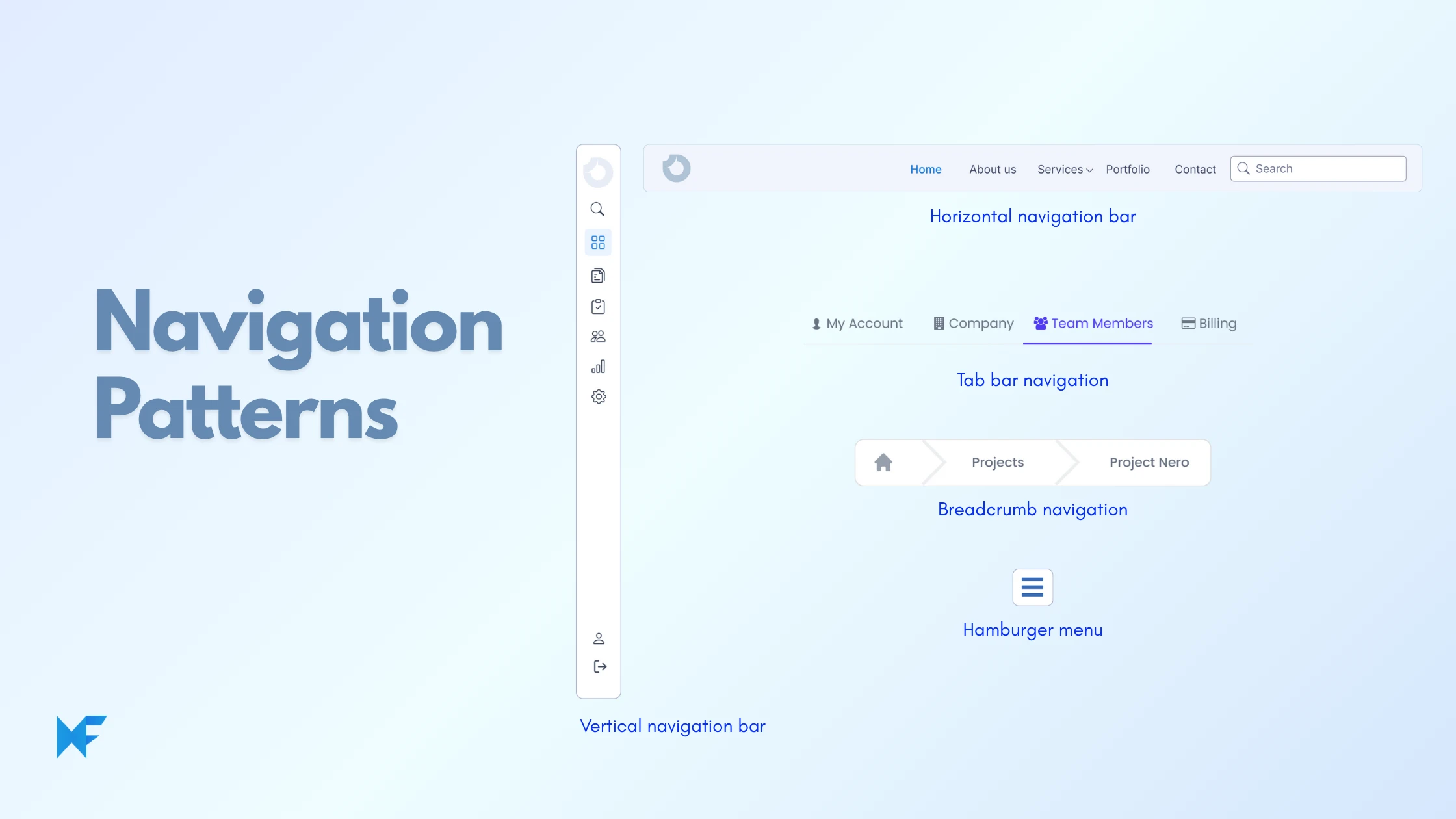
Horizontal Navigation Bar
The horizontal navigation bar remains the most common pattern for primary navigation, typically positioned at the top of the page. This pattern works well for sites with 5-7 main sections, as it provides easy scanning and clear hierarchy.
Best practices include using clear, descriptive labels, maintaining consistent placement across pages, and indicating the current page or section. The pattern breaks down with too many items, leading to overcrowding or awkward wrapping.
Vertical Sidebar Navigation
Sidebar navigation excels for applications with many navigation options or complex hierarchies. It provides more space for labels and can accommodate expandable sections for sub-navigation.
This pattern is particularly effective for dashboards, admin interfaces, and content-heavy sites. The sidebar can be persistent (always visible) or collapsible to save screen space, especially on smaller screens.
Hamburger Menu
The hamburger menu (three horizontal lines) became popular with mobile interfaces but has spread to desktop applications. It saves screen space by hiding navigation behind a recognizable icon.
However, this pattern has usability trade-offs. Hidden navigation reduces discoverability and can increase cognitive load. It works best when navigation is secondary to content consumption or when screen space is extremely limited.
Tab Navigation
Tabs organize related content into distinct sections while keeping all options visible. This pattern works well for organizing dense information or workflow steps.
Effective tab design requires clear labeling, visual indication of the active tab, and logical grouping. Tabs should feel like natural divisions of a larger topic rather than arbitrary organizational choices.
Breadcrumbs
Breadcrumbs show users their location within a site hierarchy and provide quick navigation back to parent levels. They're especially valuable for deep, hierarchical sites like e-commerce categories or documentation.
The pattern typically follows a "Home > Category > Subcategory > Current Page" format with clickable links for each level. Breadcrumbs should complement, not replace, primary navigation.
Pagination
Pagination breaks large content sets into manageable chunks while providing navigation controls. Traditional numbered pagination works well when users need to understand the full scope of content or jump to specific sections.
Infinite scroll has emerged as an alternative that eliminates the need for explicit navigation by loading content automatically. This pattern works well for social feeds or image galleries but can be problematic when users need to reach footer content or return to specific items.
Filters and Sorting
Filter and sort controls help users narrow down large datasets to find relevant items. These patterns are essential for e-commerce, directory sites, and any interface presenting multiple options.
Effective filtering provides clear categories, shows the number of results for each filter option, and makes it easy to clear or modify selections. The pattern should maintain user context and provide feedback about applied filters.
In-Page Navigation
For long-form content, in-page navigation helps users jump to specific sections. This might include a table of contents, anchor links, or a floating navigation widget that follows the user's scroll position.
The pattern is particularly valuable for documentation, articles, and form-heavy pages where users might need to reference different sections quickly.
Related Links
Related link patterns help users discover relevant content and continue their journey through a site. This includes "related articles," "you might also like," and cross-selling recommendations.
These patterns require careful curation or intelligent algorithms to ensure relevance. Poor related links can distract users from their primary goals or create confusion about site organization.
Interactive Element Patterns
Interactive element patterns define how users engage with interface components. These patterns establish expectations for behavior and provide consistent interaction models.
Button Patterns
Visual hierarchy in button design guides users toward intended actions. Primary buttons use prominent styling for main actions, while secondary buttons provide alternatives without competing for attention.
Effective button patterns include appropriate sizing for touch targets, clear labeling that describes the action outcome, and consistent styling that matches the action's importance.
Buttons states help provide clear feedback about their current state. This includes default, hover, active, disabled, and loading states, each with distinct visual characteristics.
State changes should be immediate and obvious, helping users understand their interactions and build confidence in the interface's responsiveness.
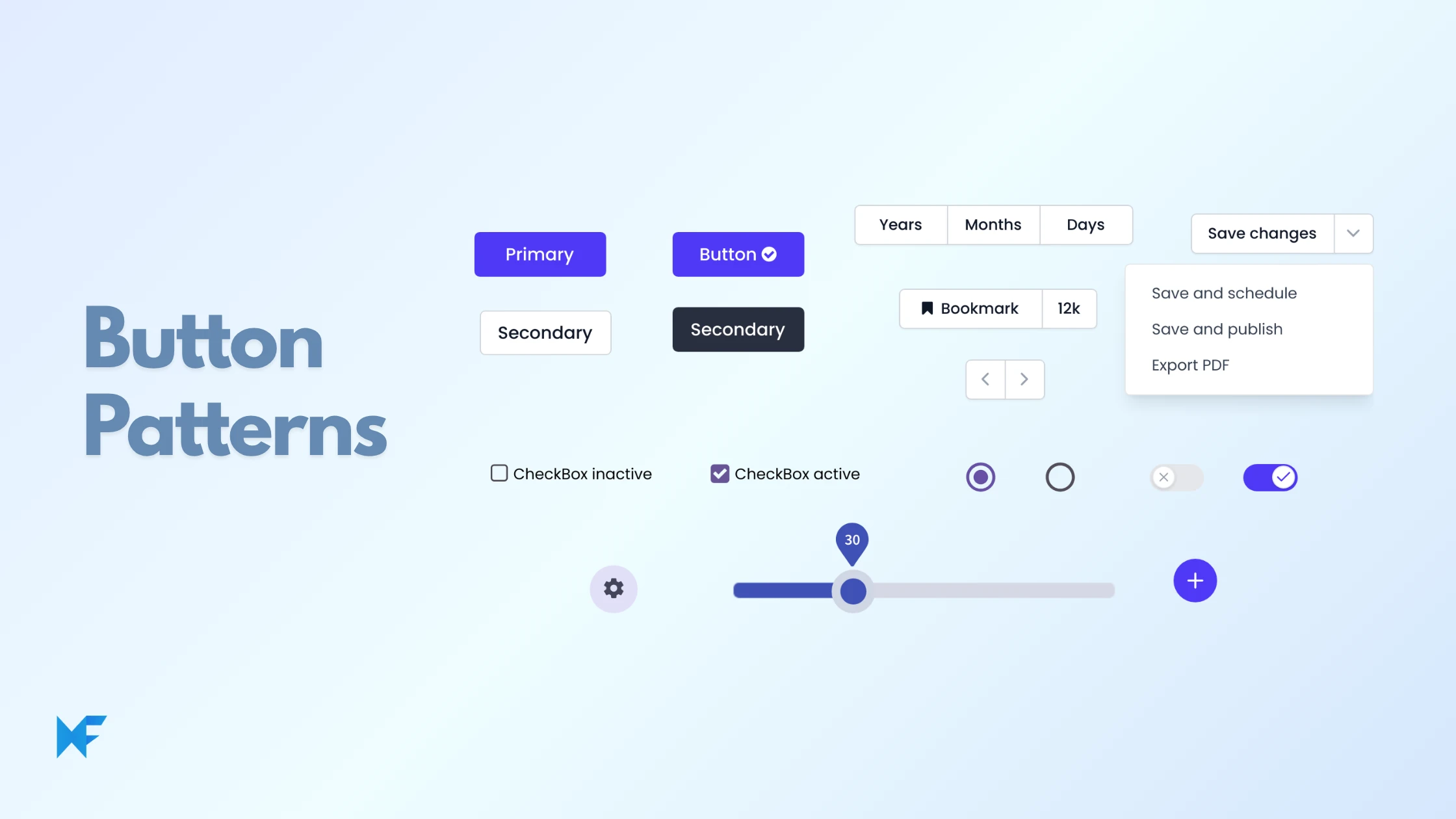
Checkboxes and Radio Buttons
Selection controls help users make choices within forms and interfaces. Checkboxes allow multiple selections, while radio buttons enforce single selection within a group.
Clear labeling, appropriate spacing, and logical grouping make selection interfaces more usable. Custom styling should maintain familiar interaction patterns while matching overall design aesthetics.
Toggle Switches
Toggle switches represent binary choices with immediate effect, like enabling or disabling features. They should clearly indicate current state and the result of toggling.
Effective toggle design includes clear labeling, obvious state differentiation, and immediate feedback when changed. The pattern works best for settings that take effect immediately rather than requiring additional confirmation.
Accordion Menus
Accordions organize content into collapsible sections, allowing users to focus on relevant information while keeping related content accessible. They work well for FAQs, settings panels, and progressive disclosure interfaces.
Good accordion design includes clear section labels, obvious expand/collapse affordances, and consideration for whether multiple sections can be open simultaneously.
Dropdown Menus
Dropdown menus reveal additional options when activated, saving screen space while maintaining option accessibility. They range from simple select menus to complex multi-level navigation systems.
Usability considerations include keyboard navigation support, appropriate trigger areas, and clear visual hierarchy within menu options.
Input and Form Patterns
Form patterns address one of the most critical interaction points between users and digital systems. Well-designed forms minimize friction while collecting necessary information accurately.
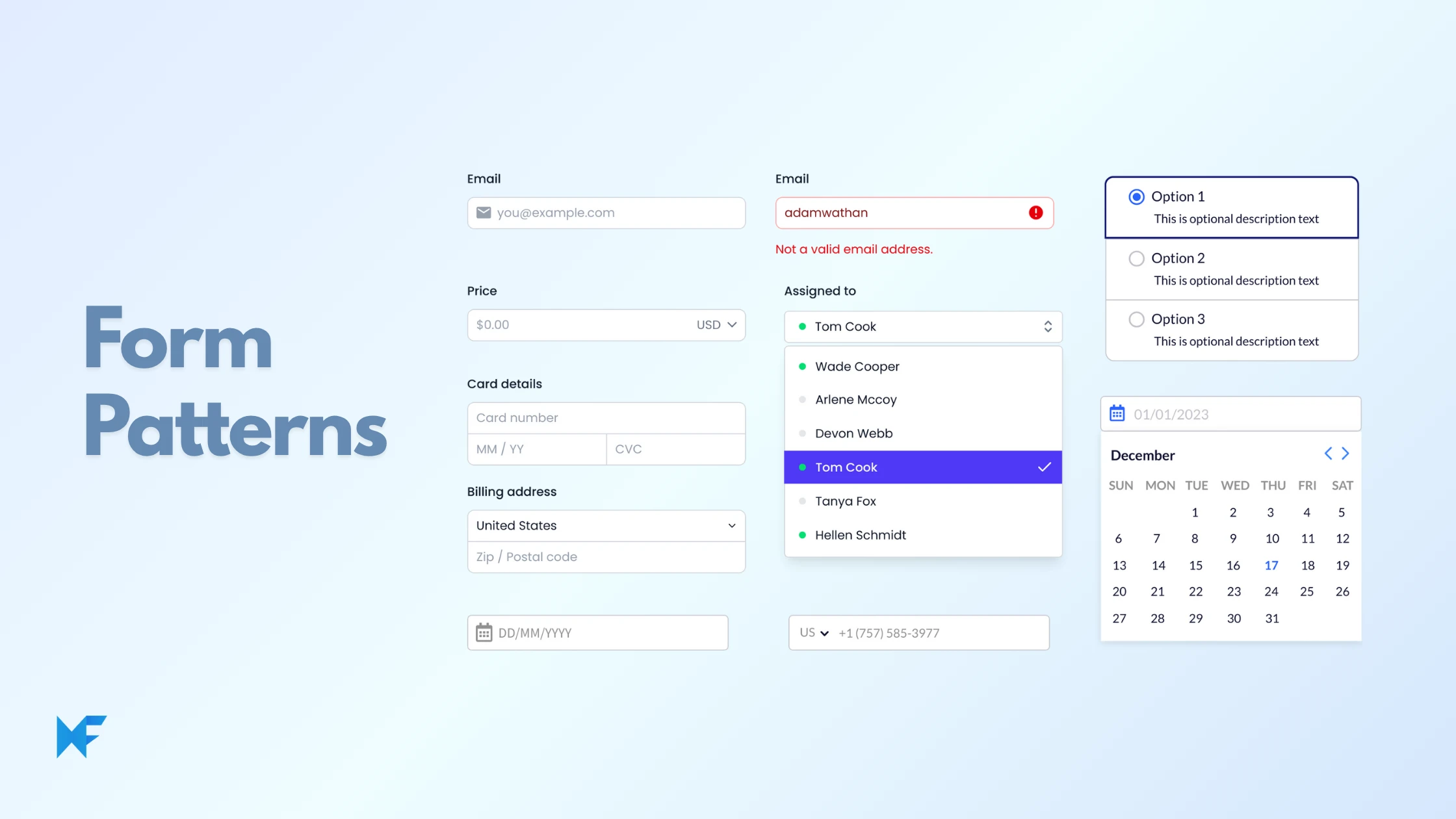
Grouped Fields
Grouping related fields helps users understand information relationships and complete forms more efficiently. Visual grouping through whitespace, borders, or background colors makes complex forms more approachable.
Effective grouping reflects logical information categories and user mental models. For example, grouping billing and shipping address fields separately helps users understand when they might provide different information for each.
Multi-Step Forms
Complex forms can be broken into multiple steps to reduce perceived complexity and allow users to focus on one category of information at a time.
Successful multi-step forms include clear progress indicators, the ability to review and edit previous steps, and logical flow between sections. Each step should feel substantial enough to justify the separation while not being overwhelming.
Label Positioning
Field labels can be positioned above, beside, or within input fields. Top-aligned labels offer the best usability for most situations, providing clear association while supporting variable content lengths.
Left-aligned labels create compact forms but can be challenging to scan quickly. Placeholder text as labels saves space but disappears when users start typing, potentially causing confusion for complex forms.
Feedback and Communication Patterns
Feedback patterns ensure users understand system status, the results of their actions, and any issues that require attention. These patterns are crucial for building user confidence and trust.
Loading Indicators
Loading patterns manage user expectations during system processing. Different types of loading indicators suit different contexts and processing times.
Spinners work for short waits, progress bars help users understand longer processes, and skeleton screens maintain interface structure while content loads. The pattern should match the user's need for information about progress and remaining time.
Progress Indicators
Progress indicators help users understand their advancement through multi-step processes. Linear progress bars work well for sequential processes, while step indicators show discrete phases.
Effective progress patterns indicate current position, completed steps, and remaining work. They should be accurate and update reliably to maintain user trust.
Toast Messages
Toast notifications provide temporary feedback that doesn't interrupt the user's workflow. They're ideal for confirming actions, showing brief status updates, or providing non-critical information.
Toasts should be brief, positioned consistently, and automatically dismiss after appropriate timing. They shouldn't contain critical information that users might need to reference later.
Alert Dialogs
Modal alerts interrupt the user's workflow to communicate important information or request decisions. They should be reserved for situations that truly require immediate attention.
Inline Messages
Inline messages provide contextual feedback within the interface flow. They're particularly effective for form validation, contextual help, or status updates that relate to specific interface sections.
Error Handling Patterns
Graceful Degradation ensures users can still accomplish their goals or understand failures using fallback functionality, cached content, or alternative workflows. Retry Mechanisms help users recover from temporary failures with retry buttons, automatic retry with feedback, and smart retry logic.
Data Display Patterns
Data display patterns help users understand, analyze, and act on information. These patterns range from simple lists to complex visualizations, each suited to different types of data and user goals.
Data Tables
Data tables organize structured information in rows and columns, making it easy to compare values and scan for specific information. Effective table design includes clear headers, appropriate spacing, and support for common tasks like sorting and filtering.
Modern table patterns address responsive design challenges through techniques like horizontal scrolling, column prioritization, or transforming tables into card layouts on smaller screens.
Activity Feeds
Activity feeds present chronological information streams, common in social media, notifications, and update logs. Effective feed design balances information density with readability.
Key considerations include item spacing, metadata presentation, action integration, and handling of different content types within the same feed structure.
Infinite Scroll vs. Pagination
Both patterns address navigation through large datasets but with different user experience implications. Infinite scroll works well for exploratory browsing, while pagination supports specific item targeting and easier navigation control.
The choice depends on user behavior patterns, content type, and technical requirements like SEO and performance.
Dashboard Layouts
Dashboards present multiple data visualizations and key metrics in a single view. Effective dashboard design prioritizes the most important information while maintaining scannable organization.
Patterns include widget-based layouts, customizable arrangements, and responsive behavior that maintains data clarity across screen sizes.
Chart and Graph Integration
Data visualization patterns should match data types and user analysis needs. Bar charts compare categories, line charts show trends over time, and pie charts illustrate proportional relationships.
Interactive features like hover details, zooming, and filtering can enhance data exploration while maintaining simple initial presentations.
When to Use (and Not Use) UI Patterns
Using UI patterns isn’t about blindly copying what others do. It’s about selecting the right pattern for the right context.
Use a pattern when:
- The user’s mental model expects it (e.g., a cart icon for checkout)
- The task is common and repeatable
- You want to reduce time-to-learn
Avoid patterns when:
- They don’t fit the content (e.g., using tabs when there’s not enough content to justify separation)
- They solve a different problem than the one you’re facing
- You’re forcing a mobile pattern into a desktop experience without adaptation
Design patterns should enhance the experience — not box you in.
How UI Patterns Fit into the Design Process
UI design patterns are most effective when used rightly in the design process:
- During wireframing: Quickly block out known interactions like modals, nav bars, or cards.
- In prototyping: Let testers focus on experience flow instead of unfamiliar layouts.
- In design systems: Create a reusable library of pattern components for consistency across teams and projects.
By thinking in patterns, you design interfaces that are faster to build, easier to test, and more predictable for users.
Design Faster, Smarter, and More Consistently
UI design patterns aren’t shortcuts - they’re tools. They let you focus on solving product-specific challenges by taking care of the interface basics. When used wisely, they help you deliver interfaces that feel instantly usable, even to first-time users.
Whether you’re wireframing your next feature or building out a design system, incorporating the right UI patterns will help you create experiences that feel both familiar and thoughtful — not generic.
Start designing with ready-to-use UI patterns. Try MockFlow